
Wednesday, November 27, 2013
Saturday, October 12, 2013

Friday, October 11, 2013
From 2004// Saltz on the use of photography in painting
The Richter Resolution
Photo finish: Calling for a four-year moratorium on a fashionable, far too overworked trend
This is not a geezer rant about loss of skills, bad drawing, laziness, or cheating. I'm not trying to put the genie back in the bottle. Like brushes and rulers, projectors are tools. This is about how these tools are used, which lately has become unadventurous. I address this mainly to students and do so provisionally, not prescriptively or prohibitively. Basically, this is a celebration of artists who find original ways to use these devices and an indictment of those who have turned this type of depiction into a tedious tic.
By now, almost everyone would agree that the traditional Warhol-Richter-Walter Benjamin defense of the use of photography in painting, the "Art in the Age of Mechanical Reproduction" argument, and the chatter about "interrogating representation" or "investigating the problem of the photograph," isn't just dated, it's shtick. We all know that photography is a remarkable and remarkably complex way of seeing and picturing the world; that the space between the photograph, the photographer, and the thing photographed is incredibly rich; that the graphic field of the photograph is often scintillatingly alive, specific, and very post-Renaissance; and that reproducing photographs in paintings once represented a significant repudiation of dearly held beliefs. There's always a buzz about seeing images of images, or in the case of Pop art, icons of icons. But there hasn't been a "problem of the photograph" for more than a decade, only a problem with the people who think there is. The camera, which was supposed to supplant painting, didn't. Instead, painting—ever the sponge and always elastic—absorbed it and discovered new realms to explore.

These days, much photo-based painting looks the same (ditto digitally based abstraction, but we'll deal with that another time): a newspaper photo, picture of an urban or suburban setting, an airport or a hotel; a celebrity, fashion model, or porn star; a stadium, pavilion, or modernist interior; a still from a film; a yearbook pic; shots of young people doing anything; or any advertisement. These images are typically rendered in kaleidoscopic color, blurred pigments, or washy black and white. Regardless of who makes these monotonous knockoffs, the results are the same: variations on Richter, Warhol, Tuymans, Polke, Celmins, Fischl, Rauschenberg, Peyton, Doig, Close, Robert Longo, Lisa Ruyter, or any original photorealist. Unlike their lemming-like imitators, all these artists have employed photographs in original ways.
Like all media, painting has certain weapons of mass destruction at its disposal. Fervent fans of painting (like me) think these WMDs are the reasons painting has been around for so long and why it's so bottomless. They include drawing, color, surface, touch, working from the imagination or observation, and the mystical ability to embed thought in viscous substance. This alchemical artillery is typically restricted or curtailed altogether in work that simply reproduces a photograph by mechanical means. The results are what I often think of as fake artand easy solutions.
Often, faint pencil marks are visible where the artist has carefully followed projected outlines (see especially nostrils, mouths, and hands). This isn't drawing, or even an idea of it. It's mindless copying. Yet even this nondrawing would be fine if it were purposeful. Usually, it's not. These painters are just trying to get the photo right, like diligent grade-schoolers. There's little ad-libbing, invention, exploration, or discovery, just standard twists, shifts, and blurs. There's no exultation in looking or seeing or space. Yet painting is so powerful that it can run effectively with almost all of its cylinders rendered ineffective. That's why some of this art passes as something rather than nothing—although all of it will look dated in no time.
The point is, cameras see things in a very particular, very identifiable way—with a single "eye," usually a 50-millimeter one. Our eye's lens is variable (to focus near and far) and is approximately 80mm. The perception of space varies from person to person and depends on experience and emotional and refractive state. Nearsighted people tend to be center-oriented while ignoring the periphery. Others have difficulty focusing on details, but notice everything around them. The eye is round; the film plane is flat. Camera lenses correct for chromatic and spherical abnormalities; we don't. Eyes scan; cameras crop. Either way, the instant I see a painting with an image that has been reproduced by rote, I know it: Much of the life of the painting drains away, and I die a little. All I am saying is give the alchemy of painting a chance.
Saltz/Neo-Mannerism
 |
| William Powhida's good imitations of bad art, at Charlie James Gallery in Los Angeles. He's right: Don't paint like that. Jerry Saltz on Art’s Insidious |
Scads of artists are trying to be junior postmodernists. A phalanx of work has appeared that might be called "Modest Abstraction" or "MFA See, MFA Do." It's everywhere, and it all looks the same. In sculpture there's Anarchy Lite. Those post-minimalist formal arrangements of clunky stuff, sticks, planks, bent metal, wood boxes, fabric, old furniture, concrete things, and whatnot leaned, stacked, stuck, piled, or dispersed around a clean white gallery. There's usually a subtext about wastefulness, sustainability, politics, urbanism, or art history. That history is almost always straight out of sixties and seventies Artforummagazines or the syllabi of academic teachers who've scared their students into being pleasingly meek, imitative, and ordinary.
Looking at 2-D work, I'm this close to that old Carter-administration-era croak of "Painting is dead." Again. Nowadays we see endless arrays of decorous, medium-size, handsome, harmless paintings. It's rendered mainly in black, white, gray, or, more recently, violet or blue. Much of it entails transfer techniques, silkscreening, stenciling, assemblage, collage, a little spray painting or scraping and the like. There might be some smooshy blocks of color or stripes or other obvious open-form abstraction or geometric motif. A few painters are doing the same thing but with brighter colors, larger areas of paint, hints of gesture, or even drips. All this work has readymade references to preapproved, mostly male painters like Albert Oehlen, Christopher Wool, Michael Krebber, Wade Guyton, Laura Owens, and Sergej Jensen*, or to the Minimalism or Pop movements, and of course it all calls up Warhol, Richter, Kippenberger, or Prince.
Then there are all the fussy collages of cut-up porn, furniture catalogues, ads, Internet screen-grabs, modernist architecture, urban wastelands, endangered species, sixties protests, or (of course) art-historical jpegs. We also see small-scale, colored, neatly framed, or cut-up photographs about photography. All of this Neo-Mannerism is an art of infinite regress. Defensive. Predictable. Safe. Well-defended. Loved by brainy magazines, websites, and curators but so far up its own ass that it can't breathe.
If art comes from everywhere and everyone thinks differently, why does so much of what we see these days look the same? Reams of artists influenced by and using the same art-history, artists, styles, and stuff. You know what that leads to. As Keith Richards wrote of a former dope dealer of his who got addicted to his own stuff, "Brad's dead now. It was the usual old story. If you're dealing in this shit, don't dabble in it." Artists making this generic work are Brad.
It's spreading, too. Even our wonderful smaller galleries on the Lower East Side, in Bushwick, and the like are awash in it. All this art is dying to beunderstood. And it is, instantly, by everyone, in the exact same way. Never mind that Oscar Wilde said, "The moment you think you know a work of art, it is dead to you." It fills galleries and biennials and is already so dead-on-arrival it may as well put a gun to its own head. It's all intellectual wallpaper, pricey placeholders, ham-acting, and showbiz. I know artists are facing knotty times, and I say this with love, but: Enough.
*An earlier version of this post misspelled the name of the artist Sergej Jensen. Also, an earlier photo appearing with this story showed art that did not represent this trend.
Thursday, October 3, 2013
Fleisher Ollman
|

Tuesday, October 1, 2013
from HyperAlergic
Matthew Day Jackson: Too Big, Too Failed

Matthew Day Jackson, “Something Ancient, Something New, Something Stolen, Something Blue” Hauser & Wirth, West 18th Street (photographs by the author for Hyperallergic)
Matthew Day Jackson’s Something Ancient, Something New, Something Stolen, Something Blue presents, as its very title suggests, a confused medley of disconnected work. If in time the exhibition isn’t simply forgotten, it will surely serve to demonstrate the ills of over-production, and the hubris of New York’s cavernous mega galleries.
What happened here? Did Hauser & Wirth cajole and overstretch Jackson (all 25 works were produced this year) or could they simply not rein him in? The show is a Wikipedia binge writ large. Spectacular themes without substance. The lunar landings, atomic weapons, drag racing, death, anatomy, it’s all there, but none of it amounts to very much.

Matthew Day Jackson, “Magnificent Desolation”
It’s painful because Jackson is a talented artist. His reappropriations ofLife magazine covers are playful and spooky. In its heyday, Life offered a manageable digest of the world, delivered straight to your coffee table. It was a staple comfort for a generation of Americans. Playing off its promises, Jackson has produced a range of multi-media pieces that cleverly riff off Cold War anxieties.
In comparison, his latest offerings exhibit all the charisma of a knock-off Banksy. Everything is one note. At the center of the main space sits “Magnificent Desolation,” a reimagining of Rodin’s “The Burghers of Calais” (1889). In Jackson’s sculpture, the figures stand upon the crater-ridden surface of the moon and appear to be melting alive. It’s the sort of work that would look great as an amusing doodle, but not rendered at great expense in bronze. Is art history simply fodder for visual jokes and memes? Why not utilize the story of the Burghers in a more inventive way?

Matthew Day Jackson, “Alone in Relationship to the Absurd”
It’s a similar case with “Alone in Relationship to the Absurd,” a sculpture so literal in its figuration that Albert Camus would have eye rolled. A charred wooden figure crouches despondently in the bottom corner of a room, which itself has been cut out and hermetically displayed in a plexiglass cube. The work straddles two of the show’s spaces, so the back of it is visible in the next room that houses “Magnificent Desolation.” Why? Who knows, because you can’t see the wooden figure on the other side, only the wooden paneling against which it sits. Cutting out a small square portion of one of the exhibit’s walls serves only one conceivable purpose; to show off Hauser & Wirth’s space. Elsewhere, white walls have been substituted for T-111 siding and drywall in order to, as the press release puts it, “reinforce the artist’s interest in issues of civilization and themes of exploration, conquest, and consequences.”
The press release, which at over 1,750 words is twice the length of this review, encapsulates the apparent conceptual strategy of the work, to proffer a range of meaningless and disconnected signifiers. There are pieces based on anatomical studies, a cross section of an astronaut’s head, shelves displaying random body parts and wooden branches. The vacillation of subject matter is infuriating. Its obsequious dependence on spectacle is enraging.

Matthew Day Jackson’s “We, Us, Them” in mid transition
For all the expense, the works feel cheap. Worst of all, they undermine themselves in unintended ways. “We, Us, Them” is a case in point. The work takes the form of a scrolling billboard, its panels rotating every five minutes, displaying three different scenes; a reflective surface, a monochrome relief of the moon, and a mountainous valley. In a show already full of disparate, detached signifiers and themes, why select an advertisement tool as your method of display? It only serves to affirm the lack of depth on show. Perhaps it’s intended to be ironic? Three idealized scenes for the price of one.

Matthew Day Jackson, “Nearside (rust)”
The most compelling work on display is “Nearside (rust),” a rueful, quiet piece amidst all the thumping declarations of macho bravura. It’s the only work in which a sense of disquiet is actually achieved. Jackson usually uses his materials aggressively, but here you wonder how the work was created. Did Jackson slowly and patiently rust the piece? Were the surfaces already rusted? How much work went into creating the crater like forms? It’s a far more compelling object than the works created through state of the art optical programming technologies. One such piece, Trophy, includes a recreation of Jackson’s head. Though the application of technology is compelling, the result isn’t. It’s designed to impress at a glance.
Hauser & Wirth have clearly set out to brand Jackson as a master of spectacle, an heir apparent to Koons and Hirst. Instead, they have crowned him the art world’s Icarus. The show is a damming indictment of the needless pressures to achieve spectacle and monumentality. Size isn’t synonymous with quality, and it raises a suspicion best expressed by critic Dave Hickey, that “if you look and see nothing, there is nothing there.”
Matthew Day Jackson’s Something Ancient, Something New, Something Stolen, Something Blue continues at Hauser & Wirth (511 West 18th Street, Chelsea, Manhattan) through October 19.
Sunday, September 22, 2013
Citywide
From the UArts site:
More than 25 artist-run collectives collaborate to present a celebration of Philadelphia contemporary art this November

September 20, 2013
This November, more than 25 artist-run collectives will join forces to present a month-long celebration of Philadelphia contemporary art with CITYWIDE, a “massive collaboration” that will include a publication and feature performances, panel discussions, gallery openings and other programming in a variety of venues across the city. A Kickstarter campaign is underway through October 6 to help raise funds for this cross-collaborative event.
The University of the Arts, at the heart of Philly’s artist collective culture, is well represented at CITYWIDE, with a long list of alumni, faculty and staff whose work will be showcased during the exhibition. Participating UArts community members include Senior Lecturer and Academic AdvisorJordan Rockford BFA '00 (Photography), Craft & Material Studies Senior Lecturer Christina P. Day BFA '99 (Crafts), MFA in Studio Art Lecturer H. John Thompson MFA ’09 (Studio Art), Print Services staff member Jason Chen BFA '08 (Animation), Photography and MFA in Book Arts/Printmaking Senior Lecturer Julianna Foster MFA '06 (Book Arts/Printmaking), Sara McCorriston BFA '09 (Theater Design & Technology), Mary Smull BFA '95 (Fibers), Sculpture Shop Supervisor Lewis Colburn, Assistant Professor of Glass Alexander Rosenberg, Interdisciplinary Fine Arts Lecturer Erica Prince and Interdisciplinary Fine Arts Senior LecturerDaniel Gerwin.
These artists are members of the 25-plus participating collectives that includes Vox Populi, Space 1026, Little Berlin, Tiger Strikes Asteroid, Grizzly Grizzly, Marginal Utility, NAPOLEON, Fjord, Mt. Airy Contemporary Artists Space, Rebekah Templeton, Highwire Gallery, Basekamp, McCartney/Belknap Projects, Practice, Traction Company, InLiquid, Paradigm Gallery, Magic Pictures, Termite TV Collective, the Soapbox, Title Magazine, the Nicola Midnight St. Claire, Pterodactyl, Art/ Assembly, BYO Print and the OOF Animation Collective.
CITYWIDE is the recipient of a 2013 Knight Arts Challenge Grant from the John S. and James L. Knight Foundation.
“Philadelphia artists are dedicated community-builders. We pool our resources and volunteer our time to create gallery spaces, to make sure the art we're seeing and are moved by can be seen by anyone,” said Grizzly Grizzly artist curatorial member and former UArts lecturer Mary Smull. “CITYWIDE is possible because our audience has really responded and grown, and the Knight Foundation sees that and wants to support it.”
IMPORTANT DATES
Sunday, October 6
Kickstarter campaign ends
Sunday, October 6
Kickstarter campaign ends
First Friday, November 1
CITYWIDE exhibit openings commence and continue through the first two weeks of November
CITYWIDE exhibit openings commence and continue through the first two weeks of November
Wednesday, November 13, 11:30 a.m.
CBS Auditorium
Nicola Trezzi Lecture: the U.S. editor for Flash Art will speak in conjunction with CITYWIDE
CBS Auditorium
Nicola Trezzi Lecture: the U.S. editor for Flash Art will speak in conjunction with CITYWIDE
Wednesday, November 13, 6:30 – 8:30 p.m.
Moore College of Art & Design
CITYWIDE Panel Discussion on artist-run spaces, moderated by Richard Torchia and including Matthew Higgs, Kaytie Johnson, Nicola Trezzi and others
Moore College of Art & Design
CITYWIDE Panel Discussion on artist-run spaces, moderated by Richard Torchia and including Matthew Higgs, Kaytie Johnson, Nicola Trezzi and others
Saturday, November 16, 2 – 5 p.m.
CITYWIDE Trolley Day: shuttle bus service between all participating sites
CITYWIDE Trolley Day: shuttle bus service between all participating sites
Wednesday, September 4, 2013


Sunday, September 1, 2013
ROB SWAINSTON @ MARGINAL UTILITY
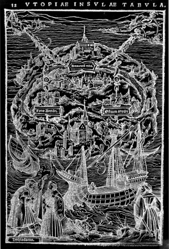
ROB SWAINSTON: WOODCUT MAP OF UTOPIA FROM THE SEPTEMBER 2013 EDITION
6 September – 20 October 2013
Opening reception Friday, 6 September 2013, from 6 – 11 pm
Artist reception Friday, 4 October 2013, from 6-11 pm
Marginal Utility is proud to present WOODCUT MAP OF UTOPIA FROM THE SEPTEMBER 2013 EDITION, a solo exhibition by the New York based artist Rob Swainston.
The show explores the interface between political and institutional structures, historical memory and print technology by exposing the “unstable image” in moments of visual interference—moiré, bitmap, collage, and line.
The exhibition draws its title from an illustration heading in a mass-market edition of Renaissance humanist Thomas More’s Utopia, picked up for free at New Harmony Vegetarian in Philly’s Chinatown, several years ago.
The illustration, Woodcut Map of Utopia From the March 1518 edition, is now out-of-copyright and displayed in cheap reproduction on self-destructing paper. This mass-market paperback is a shadow of a reminder that once people could write a book describing an idealized society via a fictionalized conversation between two people that did actually exist.
While print technologies were once cutting-edge methods of disseminating representations (maps, fine art reproductions), or political machination (treatises, manifestos, proclamations, or representations of historical events), we now have the fragmented and democratized pixel.
Swainston’s Woodcut Map addresses the dismantling of the printed image. The theme is explored in multiple forms in which different print media masquerade as each other; the line between print, video and painting is blurred; cast iron poses as wood; and a deconstruction of Léon Frédéric’s Four Seasons is translated as an inscrutable color explosion, matching our current state of “global weirding,” to Frédéric’s 1894 Academic idealism.
Swainston’s recent work employs print-based installation, video, and works on paper to explore print technology, the meaning of the image and ultimately the fragmentation and disappearance of the image.
Wednesday, August 28, 2013
Mario Ybarra @ Fabric Workshop
Mario Ybarra, Jr.: Books Of Drawings, Beyond Our Dreams, Blame Our Dads, Brains On Drugs, Better Off Dead
Opening Reception:
Friday, October 4th, 6:00–8:00 pm
Press & Members Preview: Artist talk by Mario Ybarra, Jr. at 5:30 pm
Press & Members Preview: Artist talk by Mario Ybarra, Jr. at 5:30 pm
The Fabric Workshop and Museum (FWM) presents an exhibition of new work by artist-in-residence Mario Ybarra, Jr. whose work involves examining hidden histories of U.S. street culture through large-scale, mixed media installations. Ybarra, Jr.’s collaboration with FWM serves as a vehicle for telling a creative, visual narrative of his former street crew B.O.D., established in 1990.
Bio
Born 1972, Wilmington, California. Lives and works in Wilmington.
Born 1972, Wilmington, California. Lives and works in Wilmington.
Mario Ybarra, Jr. received an MFA from the University of California, Irvine (2001) and a BFA from Otis College of Art and Design, Los Angeles (1999). Recent solo exhibitions include Double Feature at Honor Fraser Gallery, Los Angeles (2013); Mario Ybarra Jr.: The Tio Collection at the Santa Barbara Contemporary Arts Forum (2012); Wilmington Good at the Cardi Black Box, Milan, Italy (2011); Silver and Blacks at Michael Janssen Gallery, Berlin, Germany (2010); Take Me Out…No Man Is An Island at the Art Institute of Chicago (2008); and Black Squirrel Society at Lehmann Maupin Gallery, New York (2008). Ybarra, Jr. has been included in such group exhibitions as Made in L.A., the Los Angeles Biennial organized by the Hammer Museum in collaboration with LAXART (2012); Invisible Cities at the Instituto Cervantes, Madrid, Spain (2010); the Whitney Biennial, New York (2008); Phantom Sightings: Art After the Chicano Movement at the Los Angeles County Museum of Art (LACMA), Los Angeles (2008); Prague Biennale 3 in Prague, Czech Republic (2007); The World as a Stage at the Tate Modern, London, UK, as well as the Institute of Contemporary Art, Boston (2007); the California Biennial at the Orange County Museum of Art, Newport Beach (2006); and Alien Nation at the Institute of Contemporary Art, London, UK (2006).
Tuesday, August 27, 2013
Virgil Marti @ UArts
Sep 4 2013 10:00AM - 12:00PM
CBS Auditorium

Virgil Marti creates hybrid objects and environments informed by a wide range of art-historical and pop-cultural references. Known for inserting high décor into fine art contexts, his installations are rich in humor and shrewd observation. After attending Skowhegan in 1990, he worked for many years as a master printer and project coordinator at the Fabric Workshop and Museum.
His work was included in "The Jewel Thief" at the Frances Young Tang Teaching Museum (2010), "La Biennale de Montréal" (2007), "Whitney Biennial 2004" and "Apocalyptic Wallpaper" at the Wexner Center for the Arts, Columbus, Ohio (1997).
Recent collaborative projects and solo shows include "Set Pieces" at the Institute of Contemporary Art, Philadelphia (2010); "Ah! Sunflower" at the Visual Art Center, Richmond, Va. (2008); and "Directions: Virgil Marti/Pae White" at the Hirshhorn Museum, Washington, D.C. (2007). His solo exhibition, "MATRIX 167," opened on August 1 at the Wadsworth Atheneum Museum of Art in Hartford, Conn.
Above: "Sigmund," 2010; Frame materials: plywood, foam, cotton muslin, metal gliders. Upholstery fabrics: foil coated metallic leather, acrylic faux fur (wolf, mink), vinyl (faux ostrich), embroidered silk, printed cotton, cotton tapestry, linen velvet, embossed velvet, cotton bullion fringe.
Homepage: "VIP Room," detail, 2010; seven-color screenprint on Tyvek.
Hamilton Hall
320 S Broad Street
Philadelphia, PA 19102
United States
Wednesday, August 21, 2013
JASON RHOADES @ ICA
September 18 through December 29, 2013
Opening reception: Wednesday, September 18, 6-8pm
Jason Rhoades, Four Roads will be the first major American museum exhibition of the work of this exceptional artist who died in 2006 at the age of 41. Rhoades lived and worked in Los Angeles, however his art has been little seen in the United States until now.
Jason Rhoades, Four Roads will occupy the entire ICA, with four installations to be navigated by four interpretive paths or roads: Jason Rhoades, American Artist; Jason the Mason, (a biographical thread named for a childhood nickname); systems (language, scale, indexing, economies), and taboo. By foregrounding these themes, the exhibition aims to open up for investigation Rhoades's spectacular, overloaded installations. Immediately accessible and eye-catching, these works are at the same time deeply systematic, detailed, and rewarding of careful engagement. Using neon, plastic buckets, power tools, snaking wires, figurines, sound, and a vast range of other materials, including a V-8 engine, Rhoades's work brings the viewer in with humor, vibrancy, and the provocative audacity of his vision. The show will be anchored by four major installations: Garage Renovation New York (CHERRY Makita), 1993; The Creation Myth, 1998; Sutter's Mill, 2000; and Untitled (from My Madinah: In pursuit of my ermitage...), 2004/2013.
Jason Rhoades, Four Roads is among the most ambitious exhibitions ICA has ever presented. A catalogue co-published with Delmonico/Prestel will accompany the show, which will tour internationally beginning at the Orange County Museum of Art.
Monday, July 15, 2013
Peter Krashes Lecture//Wednesday July 17th

Peter Krashes
July 17, 12 p.m.
Peter Krashes is an artist and community advocate in Prospect Heights, Brooklyn, with a work practice as a painter that embraces his efforts outside the studio. Themes of engagement, empowerment and critique are part of his painted political narrative. His work has been exhibited in the He Xiangning Art Museum in Shenzhen, China, the Aldrich Contemporary Art Museum in Connecticut and Michael Klein Gallery in New York. Among the grants he has received are a Joan Mitchell Foundation Painter and Sculptors Grant and a Marshall Scholarship for study at the University of Oxford. He has taught art in numerous places including Cooper Union for the Advancement of Science and Art, Skowhegan School of Painting and Sculpture, American University, Rutgers University, and the University of the Arts.
Sunday, July 7, 2013
Saturday, July 6, 2013
Margery Amdur lecture

Margery Amdur
July 10, 12 p.m.
Originally from Pittsburgh, Margery Amdur received her BFA from Carnegie-Mellon University and her MFA from the University of Wisconsin in Madison. Since graduation, she has lived and worked throughout the U.S. Amdur has had over 50 solo and two-person exhibitions and has appeared in numerous group shows. Her international exhibitions include Turkey, Hungary and England. She has curated and organized national exhibitions “To Be Or Not To Be,” “A Painters Dilemma 2009” and “Seeing Voices: The Authentic Visual Voice 2010.” The recipient of more than a dozen awards and grants, Amdur has been reviewed in national and international publications including Sculpture Magazine, New American Paintings, Seams to be Constructed and New Art Examiner.
Monday!

Alec Karros '80
July 8, 12:30 p.m.
Alec Karros BFA ’80 (Ceramics) is currently an adjunct associate professor of Crafts/Ceramics and Liberal Arts at UArts. He has also taught at SUNY-Oswego and the University of Colorado-Boulder. He received his BFA from the Philadelphia College of Art (now the University of the Arts) in 1980 and his MFA from the Rhode Island School of Design in 1982. He received additional training at the University of Illinois Champagne-Urbana. In addition to his academic work, Alec has been producing one-of-a-kind and limited-edition functional porcelain tableware at his home in Mountainville, N.J., since 1994.
HyperAllergic//Abstraction of the 1980s

Mary Heilmann, “Rio Nido” (1987), acrylic and oil on canvas, 39 x 58 in (all images via cheimread.com)
Before there were the New Casualists, there were the Provisional Painters, and before there were the Provisional Painters, there were the 1980s.
Last week I wrote about Dying on Stage: New Painting in New York, which was billed as “the first large gallery show in New York that brings together a group of artists specifically engaging with this new mode of abstraction.”
The mode of abstraction is identified in the press release as the New Casualism, an appellation cooked up by Sharon Butler in an essay, “Abstract Painting: The New Casualists,” published in the Brooklyn Rail in 2011.
In her first paragraph, Butler acknowledges that art “exuding a kind of calculated tentativeness” is not freshly plowed terrain, citing Raphael Rubinstein, Stephen Maine and the curatorial team of Kris Chatterson and Vince Contarino, going under the name Progress Report, as having been there before her.

David Reed, “No. 230 (for Beccafumi)” (1985-1986), oil and alkyd on canvas, 108 x 36 in
Rubinstein’s essay, “Provisional Painting,” published in 2009 inArt in America (followed by a London exhibition in 2011) is the most conspicuous antecedent to Butler’s thesis, but there is a crucial distinction between her point of view, which addresses an artist’s personal development and philosophical outlook, and Rubinstein’s, which is more focused on historical and cultural associations as well as the ever-present marketplace.
Butler defines the Casualists as “restless, their thrust less intensive and more expansive” than painters who spend years developing a signature style:
[The Casualists] are unfazed by ill-defined parameters or truncated lines of thought. Like the philosopher-mathematicians who devised “fuzzy logic,” new casualists, like Suprematists, seek to accommodate a world in which there is often no clear truth or falseness.
In contrast, Rubinstein recognizes similar tendencies but portrays the Provisional Painters as if they were caught in a web of context:
I take such work to be, in part, a struggle with a medium that can seem too invested in permanence and virtuosity, in carefully planned-out compositions and layered meanings, in artistic authority and creative strength, in all the qualities that make the fine arts “fine.”
Where Butler sees artists using “their experience of everyday life [as] the filter through which they focus their paintings, entertaining multiple contradictory ideas at once,” Rubinstein finds “strategies of refusal and acts of negation.”
In other words, at the risk of simplification, Butler casts the Casualists as engaged in modes of inquiry, while Rubinstein places a premium on the Provisionals’ “casual, dashed-off, tentative, unfinished or self-cancelling” approach to making an object.
What both tendencies have in common is a rejection, or at least a deep skepticism, of formalism — a defining idea that Rubinstein’s latest curatorial effort, Reinventing Abstraction: New York Painting in the 1980s at Cheim & Read, gets to the heart of.
Of the fifteen artists in the show, Rubinstein discusses one (Mary Heilmann) in “Provisional Painting” and Butler mentions two (Thomas Nozkowski and Elizabeth Murray) in “The New Casualists,” but the genome of this generation of post-minimal abstractionists, who were born between 1939 and 1949, is embedded in the Provisional/Casual DNA.
It’s worth quoting the press release at length:
For these artists, who were in their 30s and 40s during the 1980s, it was not a question of a “return to painting,” but, rather, of finding a bridge between the radical, deconstructive abstraction of the late 1960s and 1970s (which many of them had been marked by) with a larger painting history and more subjective approaches. They opened their work to elements that had been largely excluded from abstraction in the previous decade, beginning with a reinvestigation of the conventional rectangular support. They were unafraid to explore gesture, improvisation, relational compositions, allusions to figuration and landscape, as well as art historical and cultural allusions, high and low.

Louise Fishman, “Navigation” (1981), oil on linen, 25 x 22 in
There isn’t much that’s casual or provisional about the paintings (one from each artist) on display, even though improvisation is their main modus operandi. Rubinstein’s concern with the object — its history, context and fabrication — clearly registers in the show, which emphasizes the variety of application, surface and support ranging across the works.
Attempting to create a panorama of a generation while limiting each artist to a single work is a curatorial challenge that largely succeeds here, with an overall impression of upbeat, robust experimentation. There are no “strategies of refusal” or “acts of negation” except to the constraints of formalism.
When I saw the title of the show, I thought it was a play on the phenomenal Inventing Abstraction, 1910-1925, which ran from December 23, 2012, through April 15, 2013, at the Museum of Modern Art. While there may be some intentional referencing of the MoMA show, the title turns out to be a paraphrase of a line from the artist and writer Carrie Moyer. Again from the press release:
Although many artists in the show have received significant attention, “Reinventing Abstraction” challenges existing exclusionary histories by mapping out an artistic time and place that has yet to be canonized, or even acknowledged by the museum and academic mainstream. This exhibition also hopes to draw attention to the historical grounding of much recent work by younger painters. It’s not by chance that the title takes its inspiration from painter Carrie Moyer, who, writing about Stephen Mueller in 2011, identified his as “the generation that reinvented American abstract painting.”
Still, the feeling of release coming off these paintings, which signals their makers’ liberation from a reductive and intellectualized form of abstraction, has a parallel to early abstraction’s breakaway from the demands of mimesis. It’s a headiness exploding with unforeseen possibilities.
The biomorphic forms that creep into the work of a number of these artists are a reminder that painting, like nature, is in an infinite state of flux that adheres to its own set of genetically determined rules. Like scientists, the painters in this show investigate the object’s hidden truths rather than impose conceptual or procedural parameters dictating its creation.
With the exception of the pieces by Gary Stephan [“Untitled (#45418),” 1985–88], Stephen Mueller (“Delphic Hymn,” 1989) and Terry Winters (“Point,” 1985), which flirt with Provisional/Casual irresolution, the paintings in Reinventing Abstraction are all of a piece, though it is possible to detect here and there the threat of arbitrariness that hangs over much recent painting taking a a similar anti-formalist stance.
I’m thinking in particular of Carroll Dunham’s “Horizontal Bands” (1982), an agglomeration of root vegetables and overextended snouts that anticipate the genital-proboscises prominently featured in his later paintings. While an attractive piece, there isn’t much justification for the graphic sectioning-off of the composition into the horizontal bands of the title. The painting has a lot of life, but it doesn’t seem to arise from an intuited logic or emotional urgency.

Thomas Nozkowski, “Untitled (6-30)” (1988), oil on canvas board, 16 x 20 inch
The color in Thomas Nozkowski’s “Untitled (6-30)” (1988) is just as hot as Dunham’s, but its eloquent simplicity — interlocking twists of light green and blue-violet against a cherry red field — lays out just what needs to be said and nothing more.
Stanley Whitney’s “Sixteen Songs” (1984) will startle anyone familiar with his saturated grid paintings. The clusters of loosely applied strokes from a flat, medium-width brush seem to be channeling Joan Mitchell, but in a range of high-keyed pastel color that recalls the French Impressionists as well as the Belgian Symbolist James Ensor.

Stanley Whitney, “Sixteen Songs” (1984), oil on linen, 66 x 108 in
David Reed’s otherworldly “No. 230 (for Beccafumi)” (1985-86), a vertical shaft of radiating magenta arcs countered by slices of peacock green, canary yellow and slate blue, mirrors the ascending, abbreviated forms of “The Fall of the Rebel Angels” (ca. 1524) by the Italian Mannerist painter Domenico di Pace Beccafumi (ca. 1486-1551), vividly evoking Mannerism’s intoxicating fusion of aesthetic artifice and spiritual conviction.
Beside it is Mary Heilmann’s gem, “Rio Nido” (1987), which echoes Reed’s color scheme but compiles it into an interlocking set of geometric shapes presided over by a large black wedge. The weightiness of the composition is softened by the looseness of the paint and the holes in the wedge revealing the colors beneath. Not a small painting (39 x 58 inches), it nevertheless feels warm and intimate—a simple but ravishing answer to the dehumanized precision of Neo-Geo, which dominated geometric painting at the time.

Elizabeth Murray, “Sentimental Education” (1982), oil on canvas, 127 x 96 in
Elizabeth Murray also deconstructs geometric abstraction with her kickass “Sentimental Education” (1982), a shaped canvas of zigzagging and ballooning forms that, despite its raucous energy, is virtually minimalist in comparison with her over-the-top later work. It is also entirely abstract — though edging toward allusion, it stops short of the teacups and shoes that crop up later on — which endows its black, red, yellow and blue forms with a liminal tension, even a poignancy, that intensifies its humor with a tug of the tragic.
Bill Jensen’s tightly constructed, slightly crabbed “The Tempest” (1980–81), typical of his output during the 1980s, feels like a spring ready to snap, and snap it eventually did, bursting into the freewheeling swaths of paint that flood his current work. But Louise Fishman, with her small, stunning “Navigation” (1981), full of black swirls on maculate white, is already pointing toward the more open direction her painting would later take.
The most astringent canvases are by Jonathan Lasker, Pat Steir and Joan Snyder. Like Carroll Dunham’s “Horizontal Bands,” Lasker’s painting, “Double Play” (1987), with its mirrored, map-like shapes and inverted pyramid of pink stripes against a solid ochre field, comes close to feeling arbitrary, while another symmetrical composition, Steir’s 11-and-a-half-foot-long “Last Wave Painting: Wave Becoming a Waterfall” (1987-1988), hits home with a pair of huge, brushy circles that look like they’re made out of rust and axle grease. Snyder’s even longer (12 feet) “Beanfield with Music” (1984), rendered in slabs of blackened green over raw sienna, conjures up Monet’s Giverny water lilies after they’ve gone to algae.
The earliest and perhaps the most alien object on display is Jack Whitten’s “Red, Black, Green” (1979-80). Simultaneously process-oriented and political (the colors of the title, which appear in three squares in the center of the painting, refer to the Black Liberation flag as well as the Pan-African flag), its synthesis of precision and randomness merge the distilled forms of the 1970s with the more expressive gestures explored in the following decade.

Jack Whitten, “Red, Black, Green” (1979–80), acrylic and string on canvas, 64 x 64 in
Vertical bands of bright color act as a substrate for a thick coat of black paint, which is then raked by a comb in haphazard, horizontal sweeps, revealing the color beneath. This activity is overlaid by three white concentric circles, whose perfection only adds to the sense of discomfort pervading the work. But it’s a discomfort rooted in a severe beauty that you don’t want to stop poring over.
The presence of such an unfamiliar work by Whitten, who contributed a couple of knockout pieces to the recent NYC 1993: Experimental Jet Set, Trash and No Star(February 13 – May 26, 2013) at the New Museum, makes you wonder about the artists who came up at the same time, especially those who were female and/or of color, but whose status in the marketplace is still tenuous or nonexistent. The painters in this show are here by dint of who they are now as much as what they did then.
The fifteen paintings in Reinventing Abstraction are poised on the cusp of an outmoded past and a chartless future. The bones of what came before still dot their spine, and the new muscles they’re flexing have been conditioned by the old — a perfect illustration of T.S. Eliot’s axiom that “freedom is only truly freedom when it appears against the background of an artificial limitation.”
If more recent trends in painting, call them Provisionalist or Casualist or whatever you like, seem shallow or untethered by comparison, could it be because the factors they’re reacting against, i.e., neo-Conceptualism and its evil twin, the neo-Pop excesses of Koons, Hirst et al., are that much thinner than the Minimalism and Conceptualism of the 1970s?
That is to say, how much of a counterargument can you muster in pigment and canvas to aCarsten Höller flotation tank or merry-go-round? What kind of traction can you gain if what you’re opposing is friction-free in form and content? Is art, then, in the absence of common belief systems, only as powerful as the forces (aesthetic, commercial, social, philosophical or political) it resists?
Reinventing Abstraction: New York Painting in the 1980s continues at Cheim & Read (547 West 25th Street, Chelsea, Manhattan) through August 30.
Subscribe to:
Posts (Atom)