Saturday, October 12, 2013

Friday, October 11, 2013
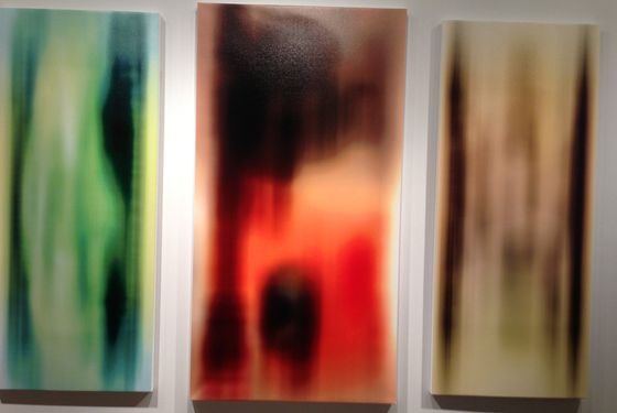
From 2004// Saltz on the use of photography in painting
The Richter Resolution
Photo finish: Calling for a four-year moratorium on a fashionable, far too overworked trend
This is not a geezer rant about loss of skills, bad drawing, laziness, or cheating. I'm not trying to put the genie back in the bottle. Like brushes and rulers, projectors are tools. This is about how these tools are used, which lately has become unadventurous. I address this mainly to students and do so provisionally, not prescriptively or prohibitively. Basically, this is a celebration of artists who find original ways to use these devices and an indictment of those who have turned this type of depiction into a tedious tic.
By now, almost everyone would agree that the traditional Warhol-Richter-Walter Benjamin defense of the use of photography in painting, the "Art in the Age of Mechanical Reproduction" argument, and the chatter about "interrogating representation" or "investigating the problem of the photograph," isn't just dated, it's shtick. We all know that photography is a remarkable and remarkably complex way of seeing and picturing the world; that the space between the photograph, the photographer, and the thing photographed is incredibly rich; that the graphic field of the photograph is often scintillatingly alive, specific, and very post-Renaissance; and that reproducing photographs in paintings once represented a significant repudiation of dearly held beliefs. There's always a buzz about seeing images of images, or in the case of Pop art, icons of icons. But there hasn't been a "problem of the photograph" for more than a decade, only a problem with the people who think there is. The camera, which was supposed to supplant painting, didn't. Instead, painting—ever the sponge and always elastic—absorbed it and discovered new realms to explore.

These days, much photo-based painting looks the same (ditto digitally based abstraction, but we'll deal with that another time): a newspaper photo, picture of an urban or suburban setting, an airport or a hotel; a celebrity, fashion model, or porn star; a stadium, pavilion, or modernist interior; a still from a film; a yearbook pic; shots of young people doing anything; or any advertisement. These images are typically rendered in kaleidoscopic color, blurred pigments, or washy black and white. Regardless of who makes these monotonous knockoffs, the results are the same: variations on Richter, Warhol, Tuymans, Polke, Celmins, Fischl, Rauschenberg, Peyton, Doig, Close, Robert Longo, Lisa Ruyter, or any original photorealist. Unlike their lemming-like imitators, all these artists have employed photographs in original ways.
Like all media, painting has certain weapons of mass destruction at its disposal. Fervent fans of painting (like me) think these WMDs are the reasons painting has been around for so long and why it's so bottomless. They include drawing, color, surface, touch, working from the imagination or observation, and the mystical ability to embed thought in viscous substance. This alchemical artillery is typically restricted or curtailed altogether in work that simply reproduces a photograph by mechanical means. The results are what I often think of as fake artand easy solutions.
Often, faint pencil marks are visible where the artist has carefully followed projected outlines (see especially nostrils, mouths, and hands). This isn't drawing, or even an idea of it. It's mindless copying. Yet even this nondrawing would be fine if it were purposeful. Usually, it's not. These painters are just trying to get the photo right, like diligent grade-schoolers. There's little ad-libbing, invention, exploration, or discovery, just standard twists, shifts, and blurs. There's no exultation in looking or seeing or space. Yet painting is so powerful that it can run effectively with almost all of its cylinders rendered ineffective. That's why some of this art passes as something rather than nothing—although all of it will look dated in no time.
The point is, cameras see things in a very particular, very identifiable way—with a single "eye," usually a 50-millimeter one. Our eye's lens is variable (to focus near and far) and is approximately 80mm. The perception of space varies from person to person and depends on experience and emotional and refractive state. Nearsighted people tend to be center-oriented while ignoring the periphery. Others have difficulty focusing on details, but notice everything around them. The eye is round; the film plane is flat. Camera lenses correct for chromatic and spherical abnormalities; we don't. Eyes scan; cameras crop. Either way, the instant I see a painting with an image that has been reproduced by rote, I know it: Much of the life of the painting drains away, and I die a little. All I am saying is give the alchemy of painting a chance.
Saltz/Neo-Mannerism
 |
| William Powhida's good imitations of bad art, at Charlie James Gallery in Los Angeles. He's right: Don't paint like that. Jerry Saltz on Art’s Insidious |
Scads of artists are trying to be junior postmodernists. A phalanx of work has appeared that might be called "Modest Abstraction" or "MFA See, MFA Do." It's everywhere, and it all looks the same. In sculpture there's Anarchy Lite. Those post-minimalist formal arrangements of clunky stuff, sticks, planks, bent metal, wood boxes, fabric, old furniture, concrete things, and whatnot leaned, stacked, stuck, piled, or dispersed around a clean white gallery. There's usually a subtext about wastefulness, sustainability, politics, urbanism, or art history. That history is almost always straight out of sixties and seventies Artforummagazines or the syllabi of academic teachers who've scared their students into being pleasingly meek, imitative, and ordinary.
Looking at 2-D work, I'm this close to that old Carter-administration-era croak of "Painting is dead." Again. Nowadays we see endless arrays of decorous, medium-size, handsome, harmless paintings. It's rendered mainly in black, white, gray, or, more recently, violet or blue. Much of it entails transfer techniques, silkscreening, stenciling, assemblage, collage, a little spray painting or scraping and the like. There might be some smooshy blocks of color or stripes or other obvious open-form abstraction or geometric motif. A few painters are doing the same thing but with brighter colors, larger areas of paint, hints of gesture, or even drips. All this work has readymade references to preapproved, mostly male painters like Albert Oehlen, Christopher Wool, Michael Krebber, Wade Guyton, Laura Owens, and Sergej Jensen*, or to the Minimalism or Pop movements, and of course it all calls up Warhol, Richter, Kippenberger, or Prince.
Then there are all the fussy collages of cut-up porn, furniture catalogues, ads, Internet screen-grabs, modernist architecture, urban wastelands, endangered species, sixties protests, or (of course) art-historical jpegs. We also see small-scale, colored, neatly framed, or cut-up photographs about photography. All of this Neo-Mannerism is an art of infinite regress. Defensive. Predictable. Safe. Well-defended. Loved by brainy magazines, websites, and curators but so far up its own ass that it can't breathe.
If art comes from everywhere and everyone thinks differently, why does so much of what we see these days look the same? Reams of artists influenced by and using the same art-history, artists, styles, and stuff. You know what that leads to. As Keith Richards wrote of a former dope dealer of his who got addicted to his own stuff, "Brad's dead now. It was the usual old story. If you're dealing in this shit, don't dabble in it." Artists making this generic work are Brad.
It's spreading, too. Even our wonderful smaller galleries on the Lower East Side, in Bushwick, and the like are awash in it. All this art is dying to beunderstood. And it is, instantly, by everyone, in the exact same way. Never mind that Oscar Wilde said, "The moment you think you know a work of art, it is dead to you." It fills galleries and biennials and is already so dead-on-arrival it may as well put a gun to its own head. It's all intellectual wallpaper, pricey placeholders, ham-acting, and showbiz. I know artists are facing knotty times, and I say this with love, but: Enough.
*An earlier version of this post misspelled the name of the artist Sergej Jensen. Also, an earlier photo appearing with this story showed art that did not represent this trend.
Thursday, October 3, 2013
Fleisher Ollman
|

Tuesday, October 1, 2013
from HyperAlergic
Matthew Day Jackson: Too Big, Too Failed

Matthew Day Jackson, “Something Ancient, Something New, Something Stolen, Something Blue” Hauser & Wirth, West 18th Street (photographs by the author for Hyperallergic)
Matthew Day Jackson’s Something Ancient, Something New, Something Stolen, Something Blue presents, as its very title suggests, a confused medley of disconnected work. If in time the exhibition isn’t simply forgotten, it will surely serve to demonstrate the ills of over-production, and the hubris of New York’s cavernous mega galleries.
What happened here? Did Hauser & Wirth cajole and overstretch Jackson (all 25 works were produced this year) or could they simply not rein him in? The show is a Wikipedia binge writ large. Spectacular themes without substance. The lunar landings, atomic weapons, drag racing, death, anatomy, it’s all there, but none of it amounts to very much.

Matthew Day Jackson, “Magnificent Desolation”
It’s painful because Jackson is a talented artist. His reappropriations ofLife magazine covers are playful and spooky. In its heyday, Life offered a manageable digest of the world, delivered straight to your coffee table. It was a staple comfort for a generation of Americans. Playing off its promises, Jackson has produced a range of multi-media pieces that cleverly riff off Cold War anxieties.
In comparison, his latest offerings exhibit all the charisma of a knock-off Banksy. Everything is one note. At the center of the main space sits “Magnificent Desolation,” a reimagining of Rodin’s “The Burghers of Calais” (1889). In Jackson’s sculpture, the figures stand upon the crater-ridden surface of the moon and appear to be melting alive. It’s the sort of work that would look great as an amusing doodle, but not rendered at great expense in bronze. Is art history simply fodder for visual jokes and memes? Why not utilize the story of the Burghers in a more inventive way?

Matthew Day Jackson, “Alone in Relationship to the Absurd”
It’s a similar case with “Alone in Relationship to the Absurd,” a sculpture so literal in its figuration that Albert Camus would have eye rolled. A charred wooden figure crouches despondently in the bottom corner of a room, which itself has been cut out and hermetically displayed in a plexiglass cube. The work straddles two of the show’s spaces, so the back of it is visible in the next room that houses “Magnificent Desolation.” Why? Who knows, because you can’t see the wooden figure on the other side, only the wooden paneling against which it sits. Cutting out a small square portion of one of the exhibit’s walls serves only one conceivable purpose; to show off Hauser & Wirth’s space. Elsewhere, white walls have been substituted for T-111 siding and drywall in order to, as the press release puts it, “reinforce the artist’s interest in issues of civilization and themes of exploration, conquest, and consequences.”
The press release, which at over 1,750 words is twice the length of this review, encapsulates the apparent conceptual strategy of the work, to proffer a range of meaningless and disconnected signifiers. There are pieces based on anatomical studies, a cross section of an astronaut’s head, shelves displaying random body parts and wooden branches. The vacillation of subject matter is infuriating. Its obsequious dependence on spectacle is enraging.

Matthew Day Jackson’s “We, Us, Them” in mid transition
For all the expense, the works feel cheap. Worst of all, they undermine themselves in unintended ways. “We, Us, Them” is a case in point. The work takes the form of a scrolling billboard, its panels rotating every five minutes, displaying three different scenes; a reflective surface, a monochrome relief of the moon, and a mountainous valley. In a show already full of disparate, detached signifiers and themes, why select an advertisement tool as your method of display? It only serves to affirm the lack of depth on show. Perhaps it’s intended to be ironic? Three idealized scenes for the price of one.

Matthew Day Jackson, “Nearside (rust)”
The most compelling work on display is “Nearside (rust),” a rueful, quiet piece amidst all the thumping declarations of macho bravura. It’s the only work in which a sense of disquiet is actually achieved. Jackson usually uses his materials aggressively, but here you wonder how the work was created. Did Jackson slowly and patiently rust the piece? Were the surfaces already rusted? How much work went into creating the crater like forms? It’s a far more compelling object than the works created through state of the art optical programming technologies. One such piece, Trophy, includes a recreation of Jackson’s head. Though the application of technology is compelling, the result isn’t. It’s designed to impress at a glance.
Hauser & Wirth have clearly set out to brand Jackson as a master of spectacle, an heir apparent to Koons and Hirst. Instead, they have crowned him the art world’s Icarus. The show is a damming indictment of the needless pressures to achieve spectacle and monumentality. Size isn’t synonymous with quality, and it raises a suspicion best expressed by critic Dave Hickey, that “if you look and see nothing, there is nothing there.”
Matthew Day Jackson’s Something Ancient, Something New, Something Stolen, Something Blue continues at Hauser & Wirth (511 West 18th Street, Chelsea, Manhattan) through October 19.
Subscribe to:
Posts (Atom)