Friday, October 11, 2013

Saltz/Neo-Mannerism

 William Powhida's good imitations of bad art, at Charlie James Gallery in Los Angeles.
He's right: Don't paint like that.


Jerry Saltz on Art’s Insidious 
New Cliché: Neo-Mannerism


Call it Neo-Mannerism. We all know it. That ever-expanding assembly of anemically boring, totally safe artistic clichés squeezing the life out of the art world right now. Earlier this week, I called out one of them, in a review of the (very good) work of Bjarne Melgaard: bad-boy installations, reeking of transgression but not actually transgressing much. That got me thinking about a trend that's even more widespread and just as annoying.
Scads of artists are trying to be junior postmodernists. A phalanx of work has appeared that might be called "Modest Abstraction" or "MFA See, MFA Do." It's everywhere, and it all looks the same. In sculpture there's Anarchy Lite. Those post-minimalist formal arrangements of clunky stuff, sticks, planks, bent metal, wood boxes, fabric, old furniture, concrete things, and whatnot leaned, stacked, stuck, piled, or dispersed around a clean white gallery. There's usually a subtext about wastefulness, sustainability, politics, urbanism, or art history. That history is almost always straight out of sixties and seventies Artforummagazines or the syllabi of academic teachers who've scared their students into being pleasingly meek, imitative, and ordinary.
Looking at 2-D work, I'm this close to that old Carter-administration-era croak of "Painting is dead." Again. Nowadays we see endless arrays of decorous, medium-size, handsome, harmless paintings. It's rendered mainly in black, white, gray, or, more recently, violet or blue. Much of it entails transfer techniques, silkscreening, stenciling, assemblage, collage, a little spray painting or scraping and the like. There might be some smooshy blocks of color or stripes or other obvious open-form abstraction or geometric motif. A few painters are doing the same thing but with brighter colors, larger areas of paint, hints of gesture, or even drips. All this work has readymade references to preapproved, mostly male painters like Albert Oehlen, Christopher Wool, Michael Krebber, Wade Guyton, Laura Owens, and Sergej Jensen*, or to the Minimalism or Pop movements, and of course it all calls up Warhol, Richter, Kippenberger, or Prince.
Then there are all the fussy collages of cut-up porn, furniture catalogues, ads, Internet screen-grabs, modernist architecture, urban wastelands, endangered species, sixties protests, or (of course) art-historical jpegs. We also see small-scale, colored, neatly framed, or cut-up photographs about photography. All of this Neo-Mannerism is an art of infinite regress. Defensive. Predictable. Safe. Well-defended. Loved by brainy magazines, websites, and curators but so far up its own ass that it can't breathe.
If art comes from everywhere and everyone thinks differently, why does so much of what we see these days look the same? Reams of artists influenced by and using the same art-history, artists, styles, and stuff. You know what that leads to. As Keith Richards wrote of a former dope dealer of his who got addicted to his own stuff, "Brad's dead now. It was the usual old story. If you're dealing in this shit, don't dabble in it." Artists making this generic work are Brad.
It's spreading, too. Even our wonderful smaller galleries on the Lower East Side, in Bushwick, and the like are awash in it. All this art is dying to beunderstood. And it is, instantly, by everyone, in the exact same way. Never mind that Oscar Wilde said, "The moment you think you know a work of art, it is dead to you." It fills galleries and biennials and is already so dead-on-arrival it may as well put a gun to its own head. It's all intellectual wallpaper, pricey placeholders, ham-acting, and showbiz. I know artists are facing knotty times, and I say this with love, but: Enough.

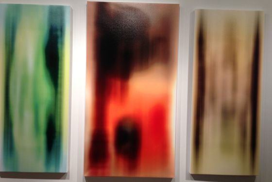
*An earlier version of this post misspelled the name of the artist Sergej Jensen. Also, an earlier photo appearing with this story showed art that did not represent this trend.

Thursday, October 3, 2013

Fleisher Ollman


Exploded Whims


October 10 - December 7, 2013
Reception: Thursday, October 10, 6-8pm
Fleisher/Ollman

This exhibition will provide a sampling of the breadth of work made by Eugene Von Bruenchenhein (1910-83), the Milwaukee-based, self-taught artist, active from the early 1940s through the early 1980s. Living in a modest house, which served as both a studio and exhibition space, with his wife and muse, Marie, he created a world of highly original beauty steeped in an idiosyncratic synthesis of non-Western art and architecture, girly magazine archetypes, theories of cosmic genesis, and current events like the Cold War fear of nuclear annihilation. Time Produced Non Better showcases Von Bruenchenhein's signature ceramics; a selection of paintings of imaginary architecture and fantastical botanical imagery; pinup-inspired black and white photographs of his wife; and rarely seen 35mm color slides of Marie and arrangements of completed art works photographed in the artist's backyard, presented in a slideshow format. Concurrent with the exhibition at Fleisher/Ollman, Adams and Ollman, Portland, OR presents a three person exhibition with Eugene Von Bruenchenhein, Felipe Jesus Consalvos and Paul Lee on view from October 4 - November 9, 2013. 

A 1947 hand-colored photographic self-portrait by Von Bruenchenhein is inscribed by the artist's hand with the following: "Edward the first king of lesser lands/Time cannot touch/He moved ten centuries/A fortress of good/Time Produced non [sic] better." While we can surmise that this statement is an homage to his father, Edward, the text's superimposition on Von Bruenchenhein's own image suggests his belief in his own greatness, a kind of icon of self-proclaimed genius. One might be struck by the artist's self-confidence--after all, he was a man of lesser means, a baker who lived frugally (he began the profession in 1944, shortly after marrying Marie, and retired in 1959 due to health reasons). His steadfast ego belied the fact that he remained unrecognized as an artist outside of his family and close friends, rarely exhibiting his work during his lifetime, though his practice spanned more than four decades. In order to make his art, however unacknowledged that pursuit was, he inhabited two different worlds--one workaday and the other a realm of artistic fantasy. The latter was made real through a tireless nocturnal work ethic, in which he sometimes collaborated with his wife Marie.

Von Bruenchenhein, along with several other self-taught artists, is featured in the 2013 Venice Biennale, The Encyclopedic Palace, June 1-November 24, and was recently included in The Alternative Guide to the Universe, Hayward Gallery, London, Summer 2013, and Great and Mighty Things: Outsider Art From the Jill and Sheldon Bonovitz Collection, Philadelphia Museum of Art, Philadelphia, Spring 2013. Fleisher/Ollman has exhibited Von Bruenchenhein's work since the mid 1990s.

Tuesday, October 1, 2013

from HyperAlergic

Matthew Day Jackson: Too Big, Too Failed

Fig.1
Matthew Day Jackson, “Something Ancient, Something New, Something Stolen, Something Blue” Hauser & Wirth, West 18th Street (photographs by the author for Hyperallergic)
Matthew Day Jackson’s Something Ancient, Something New, Something Stolen, Something Blue presents, as its very title suggests, a confused medley of disconnected work. If in time the exhibition isn’t simply forgotten, it will surely serve to demonstrate the ills of over-production, and the hubris of New York’s cavernous mega galleries.
What happened here? Did Hauser & Wirth cajole and overstretch Jackson (all 25 works were produced this year) or could they simply not rein him in? The show is a Wikipedia binge writ large. Spectacular themes without substance. The lunar landings, atomic weapons, drag racing, death, anatomy, it’s all there, but none of it amounts to very much.
"Magnificent Desolation"
Matthew Day Jackson, “Magnificent Desolation”
It’s painful because Jackson is a talented artist. His reappropriations ofLife magazine covers are playful and spooky. In its heyday, Life offered a manageable digest of the world, delivered straight to your coffee table. It was a staple comfort for a generation of Americans. Playing off its promises, Jackson has produced a range of multi-media pieces that cleverly riff off Cold War anxieties.
In comparison, his latest offerings exhibit all the charisma of a knock-off Banksy. Everything is one note. At the center of the main space sits “Magnificent Desolation,” a reimagining of Rodin’s “The Burghers of Calais” (1889). In Jackson’s sculpture, the figures stand upon the crater-ridden surface of the moon and appear to be melting alive. It’s the sort of work that would look great as an amusing doodle, but not rendered at great expense in bronze. Is art history simply fodder for visual jokes and memes? Why not utilize the story of the Burghers in a more inventive way?
Fig.3
Matthew Day Jackson, “Alone in Relationship to the Absurd”
It’s a similar case with “Alone in Relationship to the Absurd,” a sculpture so literal in its figuration that Albert Camus would have eye rolled. A charred wooden figure crouches despondently in the bottom corner of a room, which itself has been cut out and hermetically displayed in a plexiglass cube. The work straddles two of the show’s spaces, so the back of it is visible in the next room that houses “Magnificent Desolation.” Why? Who knows, because you can’t see the wooden figure on the other side, only the wooden paneling against which it sits. Cutting out a small square portion of one of the exhibit’s walls serves only one conceivable purpose; to show off Hauser & Wirth’s space. Elsewhere, white walls have been substituted for T-111 siding and drywall in order to, as the press release puts it, “reinforce the artist’s interest in issues of civilization and themes of exploration, conquest, and consequences.”
The press release, which at over 1,750 words is twice the length of this review, encapsulates the apparent conceptual strategy of the work, to proffer a range of meaningless and disconnected signifiers. There are pieces based on anatomical studies, a cross section of an astronaut’s head, shelves displaying random body parts and wooden branches. The vacillation of subject matter is infuriating. Its obsequious dependence on spectacle is enraging.
Fig.4
Matthew Day Jackson’s “We, Us, Them” in mid transition
For all the expense, the works feel cheap. Worst of all, they undermine themselves in unintended ways. “We, Us, Them” is a case in point. The work takes the form of a scrolling billboard, its panels rotating every five minutes, displaying three different scenes; a reflective surface, a monochrome relief of the moon, and a mountainous valley. In a show already full of disparate, detached signifiers and themes, why select an advertisement tool as your method of display? It only serves to affirm the lack of depth on show. Perhaps it’s intended to be ironic? Three idealized scenes for the price of one.
Matthew Day Jackson, “Nearside (rust)”
The most compelling work on display is “Nearside (rust),” a rueful, quiet piece amidst all the thumping declarations of macho bravura. It’s the only work in which a sense of disquiet is actually achieved. Jackson usually uses his materials aggressively, but here you wonder how the work was created. Did Jackson slowly and patiently rust the piece? Were the surfaces already rusted? How much work went into creating the crater like forms? It’s a far more compelling object than the works created through state of the art optical programming technologies. One such piece, Trophy, includes a recreation of Jackson’s head. Though the application of technology is compelling, the result isn’t. It’s designed to impress at a glance.
Hauser & Wirth have clearly set out to brand Jackson as a master of spectacle, an heir apparent to Koons and Hirst. Instead, they have crowned him the art world’s Icarus. The show is a damming indictment of the needless pressures to achieve spectacle and monumentality. Size isn’t synonymous with quality, and it raises a suspicion best expressed by critic Dave Hickey, that “if you look and see nothing, there is nothing there.”
Matthew Day Jackson’s Something Ancient, Something New, Something Stolen, Something Blue continues at Hauser & Wirth (511 West 18th Street, Chelsea, Manhattan) through October 19.

Sunday, September 22, 2013

Citywide

From the UArts site:


More than 25 artist-run collectives collaborate to present a celebration of Philadelphia contemporary art this November

September 20, 2013
This November, more than 25 artist-run collectives will join forces to present a month-long celebration of Philadelphia contemporary art with CITYWIDE, a “massive collaboration” that will include a publication and feature performances, panel discussions, gallery openings and other programming in a variety of venues across the city. A Kickstarter campaign is underway through October 6 to help raise funds for this cross-collaborative event.
The University of the Arts, at the heart of Philly’s artist collective culture, is well represented at CITYWIDE, with a long list of alumni, faculty and staff whose work will be showcased during the exhibition. Participating UArts community members include Senior Lecturer and Academic AdvisorJordan Rockford BFA '00 (Photography), Craft & Material Studies Senior Lecturer Christina P. Day BFA '99 (Crafts), MFA in Studio Art Lecturer H. John Thompson MFA ’09 (Studio Art), Print Services staff member Jason Chen BFA '08 (Animation), Photography and MFA in Book Arts/Printmaking Senior Lecturer Julianna Foster MFA '06 (Book Arts/Printmaking)Sara McCorriston BFA '09 (Theater Design & Technology)Mary Smull BFA '95 (Fibers), Sculpture Shop Supervisor Lewis Colburn, Assistant Professor of Glass Alexander Rosenberg, Interdisciplinary Fine Arts Lecturer Erica Prince and Interdisciplinary Fine Arts Senior LecturerDaniel Gerwin.
These artists are members of the 25-plus participating collectives that includes Vox Populi, Space 1026, Little Berlin, Tiger Strikes Asteroid, Grizzly Grizzly, Marginal Utility, NAPOLEON, Fjord, Mt. Airy Contemporary Artists Space, Rebekah Templeton, Highwire Gallery, Basekamp, McCartney/Belknap Projects, Practice, Traction Company, InLiquid, Paradigm Gallery, Magic Pictures, Termite TV Collective, the Soapbox, Title Magazine, the Nicola Midnight St. Claire, Pterodactyl, Art/ Assembly, BYO Print and the OOF Animation Collective.
CITYWIDE is the recipient of a 2013 Knight Arts Challenge Grant from the John S. and James L. Knight Foundation.
“Philadelphia artists are dedicated community-builders. We pool our resources and volunteer our time to create gallery spaces, to make sure the art we're seeing and are moved by can be seen by anyone,” said Grizzly Grizzly artist curatorial member and former UArts lecturer Mary Smull. “CITYWIDE is possible because our audience has really responded and grown, and the Knight Foundation sees that and wants to support it.”
IMPORTANT DATES
Sunday, October 6
Kickstarter campaign ends
First Friday, November 1
CITYWIDE exhibit openings commence and continue through the first two weeks of November
Wednesday, November 13, 11:30 a.m.
CBS Auditorium
Nicola Trezzi Lecture: the U.S. editor for Flash Art will speak in conjunction with CITYWIDE
Wednesday, November 13, 6:30 – 8:30 p.m.
Moore College of Art & Design

CITYWIDE Panel Discussion on artist-run spaces, moderated by Richard Torchia and including Matthew Higgs, Kaytie Johnson, Nicola Trezzi and others
Saturday, November 16, 2 – 5 p.m.
CITYWIDE Trolley Day: shuttle bus service between all participating sites

Sunday, September 1, 2013

ROB SWAINSTON @ MARGINAL UTILITY

ROB SWAINSTON: WOODCUT MAP OF UTOPIA FROM THE SEPTEMBER 2013 EDITION

6 September – 20 October 2013
Cover_Woodcut_Utopia_Swainston.
Opening reception Friday, 6 September 2013, from 6 – 11 pm
Artist reception Friday, 4 October 2013, from 6-11 pm
Marginal Utility is proud to present WOODCUT MAP OF UTOPIA FROM THE SEPTEMBER 2013 EDITION, a solo exhibition by the New York based artist Rob Swainston.
The show explores the interface between political and institutional structures, historical memory and print technology by exposing the “unstable image” in moments of visual interference—moiré, bitmap, collage, and line.
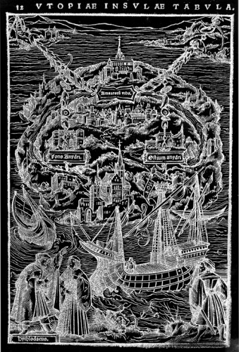
The exhibition draws its title from an illustration heading in a mass-market edition of Renaissance humanist Thomas More’s Utopia, picked up for free at New Harmony Vegetarian in Philly’s Chinatown, several years ago.
The illustration, Woodcut Map of Utopia From the March 1518 edition, is now out-of-copyright and displayed in cheap reproduction on self-destructing paper. This mass-market paperback is a shadow of a reminder that once people could write a book describing an idealized society via a fictionalized conversation between two people that did actually exist.
While print technologies were once cutting-edge methods of disseminating representations (maps, fine art reproductions), or political machination (treatises, manifestos, proclamations, or representations of historical events), we now have the fragmented and democratized pixel.
Swainston’s Woodcut Map addresses the dismantling of the printed image. The theme is explored in multiple forms in which different print media masquerade as each other; the line between print, video and painting is blurred; cast iron poses as wood; and a deconstruction of Léon Frédéric’s Four Seasons is translated as an inscrutable color explosion, matching our current state of “global weirding,” to Frédéric’s 1894 Academic idealism.
Swainston’s recent work employs print-based installation, video, and works on paper to explore print technology, the meaning of the image and ultimately the fragmentation and disappearance of the image.